Content & Web Design – Radar Consulting
Design thinking and UI/UX design of web platform for IT company
-
Jimmy George C.
In a nutshell
Business
Radar Consulting
Industry
IT Automation & IT Consulting
Location
Dubai, UAE
Website
https://radarconsulting.ae/
Project
Technology Marketing | Product Marketing | Content Productization | Design Thinking | UI/UX Design | Web Design & Development | Business Positioning
Content Assets
AutomateCIS Information | Service Portfolio | Product FAB | Use-case | Capabilities | Company Information
Brand Assets
Design Identity | Visual Identity | Visual Imagery
Marketing Model
FAB Model | Features, Advantages & Benefits
Radar Consulting is a provider of IT infrastructure management, security and automation services enabling clients to seamlessly integrate their new IT systems and processes. They provide innovative IT infrastructure and IT automation services, effectively enabling enterprises to securely navigate digital transformation journeys.
Business Requirement
This is a website for a technology consulting company headquartered in UAE and operating in GCC countries, targetting IT heads of banking/insurance/financial services, technology consultants and market aggregators in IT automation space. The core objective was to present Radar Consulting as a state-of-the-art technology player in IT infrastructure and automation services. The secondary objective was to establish exclusive position for AutomateCIS platform to aid business discovery using digital properties.
Design Thinking & Approach
Radar Consulting offers customised IT automation solutions enabling to take businesses to the next level of growth. AutomateCIS is a world-class cybersecurity compliance platform, and a scalable platform for CIS benchmarking and audit. Hence the website design had to present the core services as well as introduce the flagship product. The site design was expected to reassure the customer, allow ease of information processing, and offer adequate product literature and customer education. The expected feel was to be elegant and professional, high on user experience, as well easy to navigate and obtain information on products and services.

Our Content Marketing Goal
Finding authentic, credible IT service providers is a challenging task. To make the decision-making easier, we need to empower the prospects with relevant, technical and structured information regarding the tech solutions. So we need to focus on technology leadership, track record, FAB and tech partnerships in content, and deliver a functional, sophisticated web design. Ideally, they should feel that the entire information which is required is available on the site, for smooth decision-making.
Content Research and Content Creation
Content creation was carried out in discusssion with the top management, and by studying the product manuals and company presentations. Thereafter the content material was categorized into relevant sections, including products and services. Requisite product information was sought including key facts, characteristics and industrial use-cases. Visual content was developed in line with the technology aspect and abstraction related to the business.
Marketing Model applied for Productization
This is a technology business with a flagship automation solution for CIS benchmarking and mediation, for banking and financial services. The Feature-Advantage-Benefit (FAB) model was applied in content marketing approach.
User Experience Design
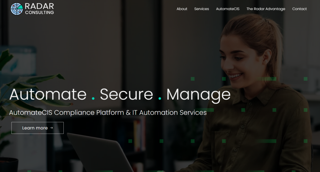
Being a technology consulting business, we chose a conventional yet functional theme. The sectioning was made intuitive and user-friendly with clear categories. The flagship product AutomateCIS was detailed with product descripton, features-advantages-benefits, quality images and infographics.
Visual Imagery
The layout was made functional for ease of comprehension. Image to text ratio was maintained with imagery around one-fourth of the total area, mostly with abstract images for technology solutions, stock images available and photographs of the founders. Icons were used wherever possible to denote products, features and key metrics. Gradients and patterns were incorporated.
Visual Identity
For colour palette we chose colours that aligned with the brand’s identity. Suggested subdued colours as well as logo colours.
Typography
We used fonts and sizes that reflect the brand’s personality and are easy to read. We decided on Poppins font having a versatile feel, with a geometric and friendly look.

