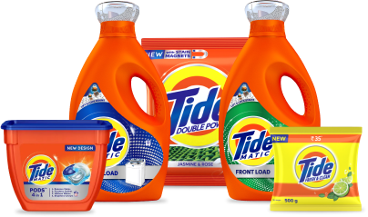

Tide is one of the world’s leading laundry detergent brands, owned by the consumer goods giant Procter & Gamble and introduced in 1946. Tide revolutionized fabric care by becoming the first heavy-duty synthetic detergent, setting new standards in stain removal. In India, Tide is considered as the third largest detergent brand, possessing double digit market share in an intensely competitive category, with a strong presence in the mid-price segment riding on its nationwide retail network.
Even in its ₹10 pack, Tide clearly communicates its promise of bright clothes, powerful cleaning, freshness, and value. The messaging is purely functional, rather than storytelling. Nevertheless, it effortlessly showcases the brand propositions, making it easy for consumers to understand what the product delivers.
The packaging emphasizes functionality and affordability, rather than premium-ness, targeted at the value-conscious consumers in the mass segment.
Brand Identity
The bright combination of orange, blue and yellow immediately attracts attention. It conveys cheerfulness and power. These colours have become synonymous with the Tide brand over the years, making the pack instantly recognizable even from a distance. The bold typeface conveys strength while slanted lettering creates a momentum. The font is informal yet confident. It reflects the brand’s promise of removing tough stains while remaining friendly.
Visual Imagery
The circular logo and lemon imagery together communicate cleanliness and freshness. This is a classic combo in in this category, and many brands follow this visual language. The lemon image indicates the fragrance variant. Overall, the imagery, though minimalistic, conveys the functional benefits quite effectively.
Brand Differentiators
The pack successfully communicates what Tide stands for—powerful cleaning, freshness and hygiene. The prominently displayed ₹10 price reinforces Tide’s value-for-money positioning. The rectangular pouch is practical, economical and designed for mass retail distribution.
The packaging emphasizes functionality and affordability, rather than premium-ness, targeted at the value-conscious consumers in the mass segment. Going forward, Tide can further enhance the consumer experience by highlighting sustainability, fabric care tips and digital engagement.
Overall, the Tide ₹10 pack projects a brand that is efficient, cheerful and reliable. It seems to say – “Main Hoon Na!”