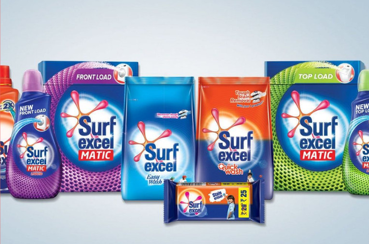

In the crowded aisle of laundry and household care, few brands command trust quite like Surf Excel. An INR 10,000 crore brand in annual sales, this fabric wash, enjoys pole position in India’s detergent market. Surf Excel is the first brand in Hindustan Unilever Ltd to reach $1 billion annual turnover, and this anchor brand enables HUL to control two-fifths of India’s detergent market.
Surf Excel’s packaging is a masterclass in FMCG communication—balancing high-efficacy functional claims with deep emotional reassurance.
Surf Excel’s packaging is a masterclass in FMCG communication—balancing high-efficacy functional claims with deep emotional reassurance.
Brand Identity
The primary colour dominating the packaging is royal blue—an industry standard for laundry and cleaning products. Blue universally represents trust, freshness, water, and cleanliness. Historically, blueing agents have been perceived as whitening and brightening agents, cementing this visual association.
Against this deep blue background, the brand name and stain-splash logo pop out with high contrast. The primary font—a sans-serif typeface resembling Utah Bold Condensed—is chosen for peak efficiency. It is highly legible from a distance, offering massive visibility on crowded supermarket shelves. The font structure conveys efficiency and directness, while giving the brand a friendly, safe feel, so essential for fast-moving consumer goods.
Visual Imagery
The visual storytelling on the pack shifts the narrative from mechanical cleaning to emotional freedom. The Splash Graphic represents powerful cleaning, particularly suited for washing machines. The young child in chef’s hat suggest freedom to play and get messy, without parents worrying about the cleanup.
Dynamic curves and motifs introduce a contemporary design language, signalling a fresh, future-ready product. The conventional, pillow-pouch packaging addresses the need for moisture protection, in-store visibility, and ease of stocking and handling.
Messaging
Stain removal is its primary functional claim, while ‘Easy Wash’ efficacy communicates convenience and labour savings. It minimises the customer’s effort in scrubbing clothes. The ‘New’ ribbon creates a sense of innovation and product improvement. The packaging provides a confident and authoritative tone. It directly targets the buyer’s core worry and offers an absolute guarantee of cleanliness.
Brand Differentiators
At its core, Surf Excel’s packaging addresses a universal household anxiety: stubborn stains. The prominent claim of ‘100%’ stain removal gives the product an immediate premium connotation. The ‘Easy Wash’ slogan adds a helpful tone.
Every element is intentionally designed to build immediate customer trust and corroborate product performance. Overall, the tone strikes the right balance: it presents the product as superior and up-to-date while remaining entirely solution-oriented.
Conclusion
Looking beyond just a tangible packet of powder, Surf Excel represents a multi-layered hierarchy of values designed to meet evolving consumer needs It serves the social need for upholding high household standards while delivering peace of mind, convenience and labour savings, and absolute assurance. It comes across as a successful brand with up-to-date packaging, a superior product which you can really believe in.