At ByGeorge Content Solutions we always strive to create a visual imagery that resonates with the user, as well as represent the business in its industry context. This greatly enhances the design and digital identity for the business and helps to position the business rightfully. We believe that understanding visual imagery is a good medium to gain insights about the project.
Jaaji Technologies helps manufacturing companies in their digital transformation journey, by providing industry-centric data analytics and digitalization technologies that facilitate prompt decision-making. The company provides smart software technologies for core industries integrating digital technologies into manufacturing operations.
In Jaaji Technologies website re-development project, we set out to create a balance between the image and the industry background. Jaaji Technologies work on technical services across industries, so the images were selected in such a way so that it complements the content and design. We tried to maintain the hierarchy between positive and negative space throughout the website.

Project Objectives
- Imagery selected should represent the business and convey info about the industry and application.
- Each image should give a pictorial story about JaajiTech software and the industry where it is used.
- All images should form part of a brand library, and maintain a consistent standard in subject, size, format etc.
Approach to Visual Imagery Selection
We selected every image very precisely because we believe that the visual content is the best way to tell a story.
a) Industry page background
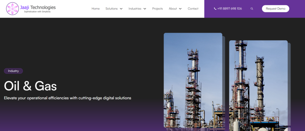
- The landing image of the industry page has a background of theme color with the name of the industry, it is a beautiful example of kerning between the text and the image.
- Balance between the positive and negative space were done in such a way so that it gives an aesthetic look.
- Kerning was beautifully done throughout the page.

b) Industry Images
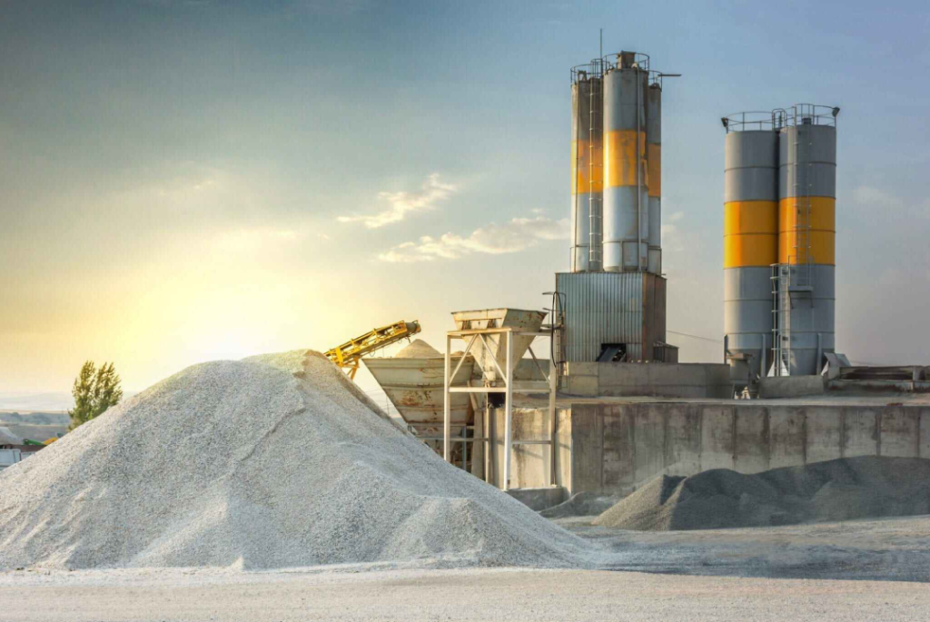
- Industry images were selected so precisely that complement the related industry.
- All images were taken in the portable network graphics (PNG) file, that gives a clear sharp look.

c) Product View on Laptop, Tablet, Mobile App
Laptop View
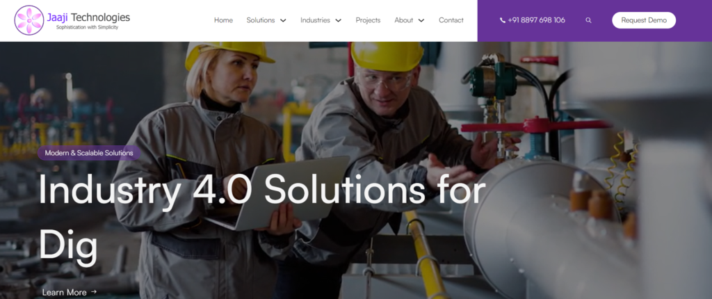
- In laptop the width of screen is 1050 pixels, the website landing page has a header with the company logo, CTA button and navigation button for the pages.
- The fonts and images size were selected according to the size of the width of the screen so it is clearly readable and visible.
- We try to create a pattern between the negative and positive space so that every element will balance.

Width : 1050 pixels
Tablet View
- In tablet there are two sizes for screen landscape and portrait, width of landscape is 990 pixels and width of portrait is 767 pixels.
- The fonts and image are adjusted according to the width of the screen.
- In portrait screen after the hero image there is an industry column with all industries , there are four panel each panel contain two industries.
- In landscape there are eight panel each panel contains one industry. This has been done for a clear view.

Landscape Width : 990 pixels, Portrait Width : 767 pixels
Mobile App View
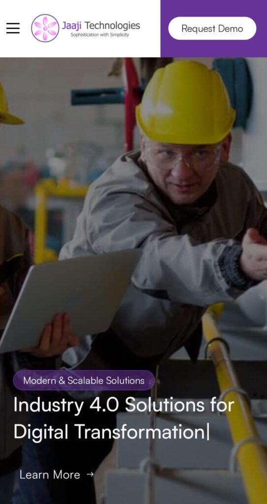
- In mobile the width of the screen is 477 pixels. In mobile header has logo of the company, CTA button and the menu bar that contains navigation for the pages.
- The ratio of the font and images were taken according to the width of the screen for a clear aesthetic view.

Width : 477 pixels
d) Templated Screenshots
- First image of the screenshot was made with the mock-up.
- We made background according to the theme of the website for screenshot, so the content in the screenshot will emphasis.
- Screenshots were edited with the help of software’s to enhance the look and readability.

Image Formatting
- Size of image in landing page of every solution is 1050*1050 pixel.
- Size of image in screenshot is 1500*1100 pixels.
- Size of every logo is under 400*400 pixels.
- Every image is in the PNG format.
Image Editing – Techniques
We use Photopea for editing the image that gives clear and sharp look and also used for resizing the image. We use Inscape for the images that are not editable in Photopea and also used for images that are not available in a good quality.
Project Insights
In this project we tried to understand each solution and according to the understanding we selected the images for each industry and solution. We maintained the hierarchy throughout the website, as balance is very important for any design and our endeavor has been to maintain that balance.
We tried to design the website so that the content should not lose the focus. We focused on every single element so that it will grab the attention of the viewer. The flow of the website was designed smartly so that user can visually find the required section and spend time there.
Project Learnings
We believe that team work is very important for any successful work. In Jaaji Technologies website re-development project we learnt new things and implemented them, and as a team we supported each other and shared inputs on design, theme, background, etc.


